45 interior design styles (with pics for every home aesthetic)
This is the only list of fashion styles you’ll ever need - complete with reference photos for each aesthetic, an accurate quiz to find your top style matches & a free worksheet (see freebie T) to help you finally pinpoint your gorgeous & unique style blend…
If you've read my fashion style guide, you’ll know I shared a game-changing, simple formula that’s helped thousands of people finally figure out what they actually like - even if they’d never been able to before.
Jump to the list of home styles
I’m no designer, but my ADHD superpower is translating abstract ideas (like “style” or “aesthetic”) into bite-sized steps and straightforward formulas anyone can follow.
This time, we’re bringing that same magic to your home.

Because your living space, just like your wardrobe, should feel like an extension of you.
Think of me as your design translator: I don’t care about trends, but I do care about helping you feel at home in your home.
When you know your unique style, it’s so much easier to choose what belongs in your space …and what doesn’t!
Because intentional living isn’t just about having less stuff - it’s about having the right stuff for you.
If you’ve ever struggled to define your home’s style - or if your space just doesn’t feel cohesive - this post is for you.
So let’s jump right in and find your dream home style blend: one that feels clear, aligned, and actually doable.
How to create your dream home style blend
step 1

You can save time by taking the free home decor style quiz first.
It will give you a shortlist of your favorite styles based on your preferences.
If you’re not in a rush, you can browse through the styles below at your leisure.
Step 2
Download your Style Formula worksheet, then scroll through the list and make a note of any decor styles that your quiz results matched you with at 60 %+ (unless they’re a ‘meh’ for you), or any that you would like to research more.
step 3
Read through the interior design style list below and update your worksheet as you go (each style will soon have a dedicated Pinterest board with 100+ reference pics to help you decide)
Step 4
Name your core home style using the Find Your Style Formula…
Just like our personal fashion style, the interior design of our home is never just one style.
Use this formula to create your dream style blend for your home:
Style 1 + Style 2 + Style 3 (optional) = Your Dream Style Blend
…It’s as simple as that!
45 different home decor styles
Pick three styles from the following list of interior design styles (keep scrolling for descriptions & inspo):
Art Deco | Artsy | Boho (classic) | Boho (neutral) | Botanical | Bright | Coastal | Comfy | Contemporary | Cottagecore | Cozy | Earthy | Eclectic | Farmhouse | French Country | Glam | Global Collection | Grandma Chic | Industrial | Japandi | Lived in | Maximalist | Masculine (formal) | Masculine (casual) | Mediterannean | Memphis | Mid-Century Modern | Minimalist | Monochrome | Moody | Palm Beach | Playful | Preppy | Regency | Retro | Romantic | Rustic | Scandinavian | Serene | Shabby Chic | Southwestern | Traditional | Urban | Vintage | Wabi-sabi
Some styles on this list are full design foundations (e.g., MCM), whereas others are more like a finishing touch or flavor (e.g., Cozy) you can layer on top.
The magic comes from mixing and matching.
When you combine 2-3 styles - whether all bold, all subtle, or a mix of both - you’ll land on something that feels authentic, personal, and uniquely you.
art deco
Mood: Glamorous, bold, and opulent. A style that’s all about making a statement - geometric shapes, metallic accents, and rich materials come together to create a look that feels like vintage luxury with a dramatic flair.

How it changes a space: Art Deco brings instant sophistication and structure to a room. It sharpens soft styles and elevates minimal spaces with ornate details. Great for people who want their home to feel like a scene from The Great Gatsby - chic, dazzling, and full of flair.
Key colors: Black, gold, silver, navy, emerald, burgundy, blush, and cream. High contrast with pops of glam metallics.
Examples of how to bring it to life:
Bold, geometric patterns (chevrons, sunbursts, fans, zigzags) on wallpaper, rugs, or tiles
Velvet furniture with sculptural shapes and gold legs
Mirrored or lacquered furniture
Brass or chrome lighting fixtures - especially chandeliers and sconces
Marble accents or glossy black elements
Curved furniture silhouettes and symmetrical layouts
Artwork or mirrors with dramatic frames
Statement bar carts or cocktail-inspired decor
Similar to: Glam, Regency, Vintage
Artsy
Mood: Expressive, thoughtful, and visually bold. A space that feels like an evolving art exhibit - layered with meaning, creativity, and pieces that spark conversation.

How it changes a space:
An artsy tone makes art the main character. Furniture, lighting, and layout are all curated to support and spotlight your creative collection - whether it’s paintings, sculptures, textiles …or your child’s surprisingly profound macaroni collage.
An artsy home feels intentional, but never stiff. It invites curiosity and interpretation. It’s perfect for anyone who wants their space to feel like a living, breathing work of art - whether you're an artist yourself or just someone who wants to be surrounded by inspiration.
Key colors: Anything goes - but could include bold pops (crimson, cobalt, mustard), grounding neutrals (charcoal, ivory) to act as a canvas, and unexpected combos.
Examples of how to bring it to life:
Oversized statement art that sets the tone for the room
Gallery walls that mix mediums: paintings, photography, textiles, even 3D objects
Sculptural furniture that blurs the line between function and art
Plinths or floating shelves to display ceramics, busts, or found objects
Abstract rugs that feel like art underfoot
Books stacked intentionally, open to favorite pages
Easels, canvases, or in-progress work
Spotlight or directional lighting to highlight key pieces
Mixing high and low: fine art + thrifted gems + DIY pieces
Walls in bold colors or painted murals for a gallery-meets-home vibe
Similar to: Eclectic, Boho (classic), Maximalist, Minimalist (when curated like a gallery), Industrial
Boho (classic)
Mood: Vibrant, collected, and soulful. A space filled with stories, color, and global inspiration. Think of a well-traveled artist’s home - layered textiles, mismatched treasures, and creativity bursting from every corner.

How it changes a space: Classic boho transforms a room into a cozy, expressive sanctuary. It invites texture, pattern, and cultural influences, creating a space that feels warm, lived-in, and endlessly interesting. Perfect for free spirits, collectors, and color-lovers who want their home to feel deeply personal and a little bit magical.
Key colors: Jewel tones like emerald, sapphire, ruby, and mustard. Rich earthy hues like terracotta, clay, and rust. Pops of turquoise or magenta layered with neutrals like tan, cream, or olive.
Examples of how to bring it to life:
Moroccan rugs or Persian-style textiles layered together
Low, floor-level seating with inviting poufs and cushions
Rattan or carved wooden furniture with character
Patterned throw pillows in ikat, kilim, or suzani prints
Plants in every corner - bonus points for macrame hangers
Tapestries, wall hangings, or beaded curtains
Art and decor collected from markets, travels, or thrift stores
String lights, lanterns, and ambient lamps for layered lighting
Similar to: Eclectic, Global Collection, Maximalist, Botanical
Boho (neutral)
Mood: Airy, earthy, and grounded. A softer, more minimalist take on boho - think desert tones, natural textures, and effortless calm. It’s boho with a breath of fresh air.

How it changes a space: Neutral boho creates a serene, relaxed vibe that still feels layered and soulful. It maintains boho’s love of texture and nature but swaps bold colors for sand, stone, and sun-bleached tones. Perfect for those who love the free-spirited aesthetic but want a calmer, more cohesive look.
Key colors: Warm neutrals like sand, cream, taupe, clay, and terracotta. Soft blacks, whites, and the occasional pop of sage or rust.
Examples of how to bring it to life:
Woven textures like jute rugs, rattan chairs, or cane-front furniture
Linen curtains and washed cotton bedding
Neutral macrame wall hangings or tassel garlands
Clay pots with trailing plants or dried grasses
Natural wood coffee tables, benches, or open shelving
Layered throw pillows in mud cloth, fringe, or simple geometric patterns
Low seating or floor cushions
Soft ambient lighting - think lanterns, candles, or basket pendants
Similar to: Scandinavian, Wabi-Sabi, Earthy, Serene
botanical
Mood: Lush, grounding, and alive. A space that celebrates nature and brings the outdoors in - full of greenery, texture, and natural rhythm. Think of it as a “jungle” or “indoor garden” style for any space.

How it changes a space: A botanical tone adds life and movement to your home. It softens harsh edges, freshens up any core style, and brings a feeling of connection to the natural world. Whether it’s a single statement plant or a full-on indoor jungle, this tone makes plants the heart of the home. Botanical plays beautifully with minimalist white walls or maximalist layering - as long as the plants are the stars.
Key colors: All shades of green (from sage to emerald), earthy browns, terracotta, creamy whites, and occasional pops of floral hues like lavender, blush, or marigold.
Examples of how to bring it to life:
Lots of indoor plants — potted, hanging, trailing, or on wall shelves (or cheat with lush artificial plants)
Botanical prints or wallpaper
Natural materials like wood, rattan, bamboo, clay, or jute
Herb gardens in the kitchen or on the windowsill
Artwork or textiles with leafy patterns
Similar to: Earthy, Boho (neutral), Cozy, Japandi, Wabi-sabi, Scandinavian, Cottagecore, Serene
If you can’t even keep a snake plant alive, try these 45 houseplant hacks
🔝 Back to Top 🔝
Bright
Mood: Cheerful, uplifting, and airy. A space that feels open, energizing, and full of light - grab your sunglasses. Think sun-soaked spaces, whites, and breezy textures.

How it changes a space: A bright tone brings in light, optimism, and a sense of clarity. It makes rooms feel larger and more awake. It’s ideal for those who want their home to feel vibrant without being loud. Not to be confused with bold or colorful tones, Bright is all about lightness and clarity.
Key colors: Crisp white and light neutrals.
Examples of how to bring it to life:
Light-colored walls and furniture
Strategically placed mirrors to reflect natural light
Sheer curtains that let sunshine in
Bright accent pillows or art that energize without overwhelming
Glossy, reflective surfaces (like white tiles or metallic accents) to bounce light back into the room
Fresh greenery in white pots for a pop of clean contrast
True-white lighting solutions to brighten up dark corners
Similar to: Coastal, Scandinavian, Minimalist, Contemporary, Serene, Monochrome
Coastal
Mood: Breezy, relaxed, and sun-kissed. A space that feels like a holiday home by the sea - airy, open, and lighthearted. Think ocean views, linen fabrics, and weathered woods that make you exhale the moment you walk in.

How it changes a space: Coastal brings an easygoing, carefree vibe to your home. It softens modern styles and brightens up traditional ones. Even landlocked spaces can feel like a beach retreat. Perfect if you love natural textures and a quiet pace of life.
Key colors: Soft whites, sandy beiges, seafoam green, sky blue, ocean blue, navy, driftwood gray, and touches of coral or shell pink.
Examples of how to bring it to life:
Striped fabrics in nautical tones
Linen sofas and breezy curtains
Whitewashed wood furniture
Sea glass or shell-inspired decor
Jute or seagrass rugs
Rattan or wicker accents
Coastal art: waves, boats, lighthouses, beach scenes, compasses
Open, uncluttered layouts with lots of natural light
Similar to: Bright, Serene, Scandinavian, Minimalist, Cottagecore
Comfy
Mood: Functional, soft, and supportive. A space designed for everyday comfort, not just what looks good in a magazine. It’s about pieces that feel good to use.
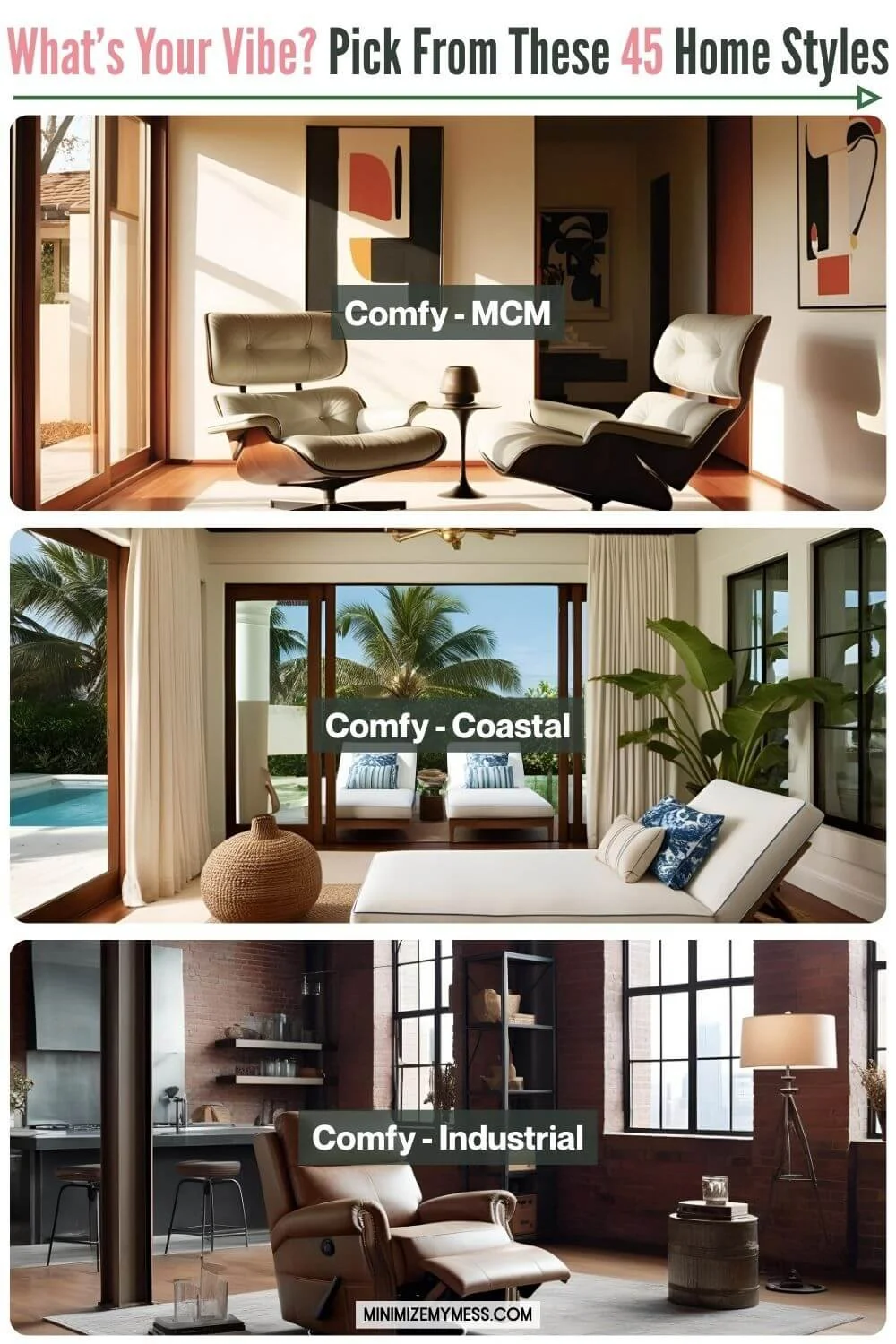
How it changes a space: Comfy tones shift the focus to how your home supports your body and lifestyle. It’s perfect for people with sensory sensitivities, chronic illness, or anyone who prioritizes coziness and ease over aesthetics alone. By choosing this as one of your style descriptors, you give yourself a permission slip to choose comfort over style when needed.
Examples of how to bring it to life:
Oversized recliners, deep sofas, or cloud-like armchairs
Supportive memory foam cushions or mattress toppers
Large-scale furniture that invites lounging and stretching out
Upholstery that's soft to the touch - chenille, velvet, boucle
Footrests, poufs, and ottomans to stretch out on
Similar to: Cozy
contemporary
Mood: Sleek, current, and ever-evolving. A space that feels polished and uncluttered, often featuring the latest trends with a timeless touch. It’s clean but not cold, modern but not stark - a stylish reflection of the “now.” Imagine walking into a high-end furniture showroom like West Elm, CB2, or Article - everything is curated, clean-lined, and on-trend without being flashy. There’s a sense of balance between cozy and cool, with a palette that feels fresh, modern, and quietly confident.
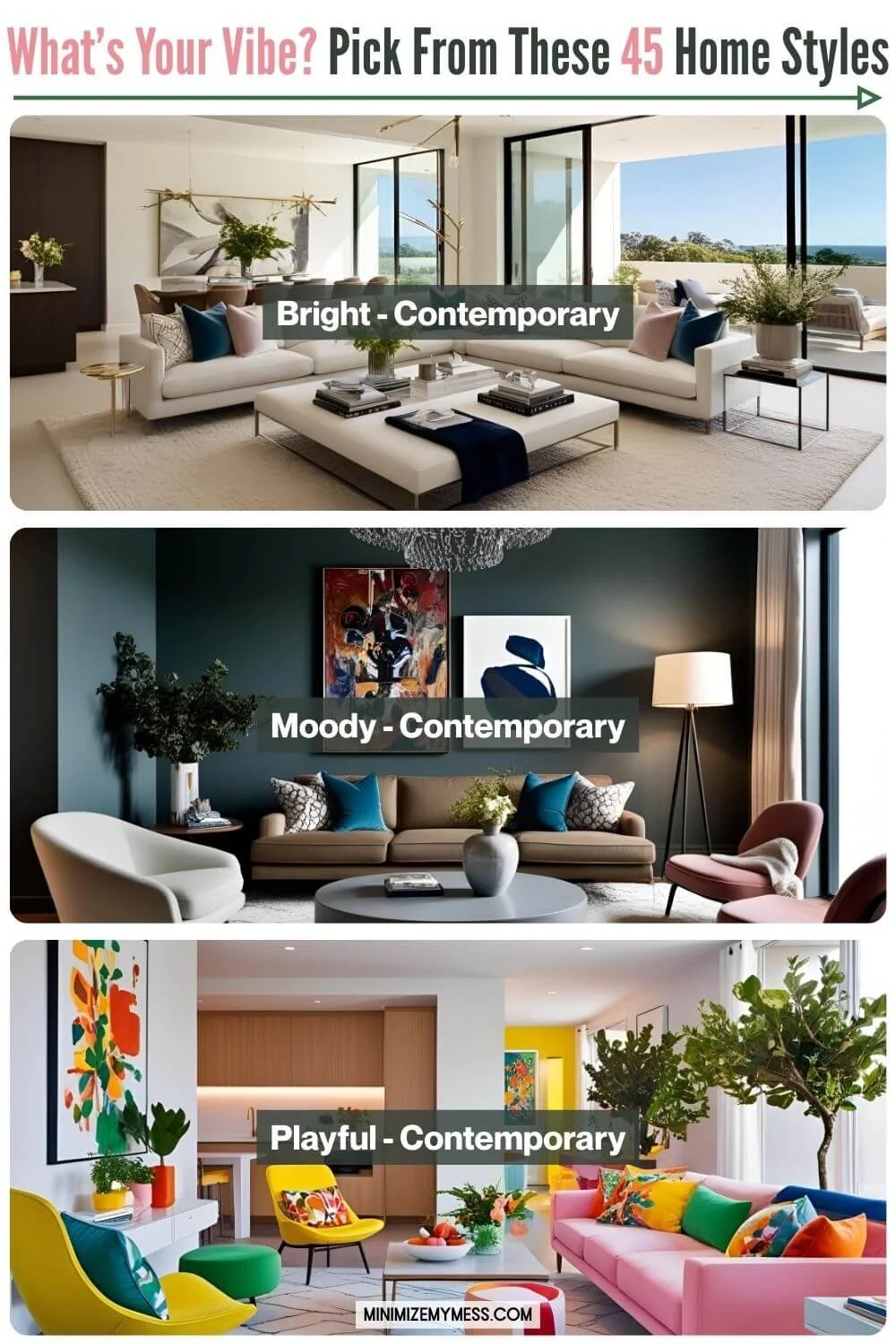
How it changes a space: Contemporary brings a fresh, updated feel to any room. It adds clarity, sophistication, and simplicity - without being overly minimal. Perfect for those who love clean lines, curated design, and want their home to feel effortlessly put-together.
Key colors: Soft neutrals like white, taupe, gray, and black with subtle accents in navy, rust, sage, or muted gold.
Examples of how to bring it to life:
Furniture with smooth, clean lines and subtle curves
Neutral color palette with strategic pops of color
Large-scale abstract art or sculptural pieces
Mixed materials: glass, metal, stone, wood
Matte and glossy finishes layered together
Open layouts and plenty of negative space
Statement lighting fixtures that double as decor
Textural interest through fabrics, wall panels, or flooring
Similar to: Modern, Minimalist, Monochrome, Scandinavian, Bright, Serene, Art Deco
Cottagecore
Mood: Whimsical, nostalgic, and storybook-sweet. Cottagecore is like stepping into a countryside fairytale - full of florals, vintage touches, and soft, romantic energy. Picture: Anne of Green Gables, Beatrix Potter illustrations. Think: Anthropologie meets a rural antiques market.

How it changes a space: Cottagecore softens and sweetens any home style. It leans into comfort, nature, and old-world charm. Think embroidered linens, dainty ceramics, and dried flower arrangements. It brings a sense of peace, slowness, and romantic simplicity into your everyday surroundings - often anchored by timeworn wooden furniture, dainty tables, spindle-back chairs, cozy armchairs, and floral upholstery.
Key colors: Soft sage, cream, faded rose, dusty blue, butter yellow, and warm wood tones.
Examples of how to bring it to life:
Vintage teacups on open shelves
Floral wallpaper
Lace curtains
Heirloom-style quilts
Dried flowers in vases
Distressed or antique wood furniture (like a farmhouse table or carved sideboard)
Spindle-back or mismatched wooden chairs
Skirted armchairs or sofas with floral slipcovers
Embroidered pillows
Baskets for everything
Similar to: Romantic, French Country, Shabby Chic, Grandma Chic, Botanical, Rustic
Cottagecore Vs French Country: French Country is more elegant, whereas Cottagecore is sweeter and whimsical
🔝 Back to Top 🔝
Cozy
Mood: Warm, inviting, and comforting. Plush textures, layers, and ambient lighting set the tone. A space that makes you want to curl up with a book and a blanket - soft lighting, plush textures, and a sense of calm. Think of it as embracing hygge - the Danish art of cozy living - in every corner of your home.

How it changes a space: Cozy tones bring a sense of comfort and closeness to any room. They add warmth and softness to more structured styles and instantly make a space feel welcoming. Perfect for homebodies, introverts, or anyone craving a little extra comfort.
Key colors: Use whatever makes you feel cozy, such as warm neutrals, soft browns, terracotta, forest green, blush pink, and creamy whites.
Examples of how to bring it to life:
Layered throw blankets and oversized knit cushions
Lamps with warm bulbs instead of overhead lighting
Candles or a flickering fireplace
Low-profile furniture with soft, deep seats
Natural textures like wool, linen, and wood
Soft rugs underfoot (think sheepskin or shag)
A cozy reading nook with a stack of books and a warm drink nearby
Similar to: Comfy
Earthy
Mood: Grounded, calm, and deeply connected to nature. An earthy space feels stable, nurturing, and timeless, like a quiet log cabin retreat or a sun-drenched adobe home. It invites you to slow down, breathe deep, and stay awhile.

How it changes a space: Earthy tones create a warm, rooted atmosphere that feels both comforting and enduring. Perfect for anyone who wants their home to feel like a safe, grounding haven.
Key colors: Terracotta, clay, ochre, moss, rust, sand, olive, charcoal - anything inspired by natural landscapes.
Examples of how to bring it to life:
Natural materials like wood, stone, rattan, clay, linen, and jute
Handmade ceramics and textured pottery
Woven baskets and organic shapes
Earth-toned textiles (blankets, cushions, rugs)
Exposed wood beams or raw edges
Dried grasses or wildflower arrangements
Artwork featuring natural scenes or earthy abstracts
A cozy reading nook with a view of the outdoors
Plants in terracotta pots or macramé hangers
Similar to: Rustic, Boho (Neutral), Wabi-Sabi, Southwestern, Japandi, Mediterranean
Eclectic
Mood: Bold, curated, and totally one-of-a-kind. Eclectic interiors feel like walking into someone’s personality. It’s layered, collected, and full of stories - a visual expression of your life, not a showroom. Imagine the vibe of a quirky local boutique where every item has a tale to tell.

How it changes a space: Eclectic style breaks all the rules in the best way. It allows for freedom, experimentation, and mixing eras, patterns, and textures. It makes your home feel deeply personal and endlessly interesting.
Key colors: Anything goes - but repeating a few shades can make the space feel more grounded.
Examples of how to bring it to life:
Mix of furniture styles and eras (like a mid-century chair with a Victorian side table)
Gallery walls with a mix of photos, art, mirrors, and objects
Bold rugs layered on top of each other
Global or vintage textiles used as throws, curtains, or wall hangings
Unexpected combinations - leopard print and florals, brass with wood, industrial next to antique
Treasures from travels or thrift shops on display
Similar to: Maximalist, Boho (Classic), Artsy, Vintage, Global Collection
Farmhouse
Mood: Warm, homey, and practical. Farmhouse style feels like a hug from your childhood kitchen - full of lived-in charm and timeless simplicity. Imagine walking into a cozy general store or a Joanna Gaines-esque antique shop filled with enamelware, vintage signs, and hearty wood furniture.

How it changes a space: Farmhouse style adds a sense of rustic familiarity and approachability. It softens modern spaces and grounds brighter styles with its use of worn wood, neutral tones, and utilitarian charm. It’s a perfect choice for those who want their home to feel welcoming, comforting, and full of character.
Key colors: Cream, warm white, beige, soft gray, sage green, barn red, navy, black accents, and warm wood tones.
Examples of how to bring it to life:
Shiplap or beadboard walls
Vintage-inspired lighting (like lantern pendants or metal sconces)
Weathered wood furniture and open shelving
Galvanized metal accents (buckets, trays, planters)
Farmhouse sinks and classic white subway tiles
Oversized wall clocks or hand-lettered signs
Wicker baskets and repurposed crates for storage
Plaid, gingham, or ticking stripe textiles
Similar to: Rustic, Cottagecore, Cozy, Traditional, French Country, Shabby Chic, Lived-In
french country
Mood: Elegant, rustic, and effortlessly romantic. French Country style blends old-world charm with relaxed sophistication - think antique markets in Provence, linen-covered armchairs, and sun-drenched kitchens with fresh bread on the counter. Picture walking into a vintage European boutique with stone floors, lavender sachets, and gilded mirrors.

How it changes a space: French Country brings softness and refinement to rustic styles, and warmth to more polished ones. It’s ideal if you love the cozy soul of farmhouse design but crave a touch more elegance and vintage flair. French Country makes your space feel lived-in, yet elevated, like your stylish grandmother’s countryside.
Key colors: Soft whites, cream, muted blues, dusty pinks, sage green, lavender, taupe, warm grays, and aged gold.
Examples of how to bring it to life:
Weathered wood furniture with carved details
Curvy lines on chairs, mirrors, and headboards
Vintage or distressed finishes with patina
Toile, ticking stripes, or floral fabrics
Antique-style chandeliers and sconces
Linen and cotton in natural hues
Fresh or dried lavender and wildflowers
Wrought iron accents (bed frames, curtain rods, wall decor)
Similar to: Farmhouse, Cottagecore, Romantic, Traditional, Shabby Chic, Rustic, Regency
🔝 Back to Top 🔝

Glam
Mood: Luxe, polished, and dramatic. Glam interiors feel elevated, indulgent, and bold - like walking into a boutique hotel or the set of an old Hollywood movie. Think velvet, mirrors, gold accents, crystal chandeliers, Jonathan Adler designs, or the beauty floor of a high-end department store.
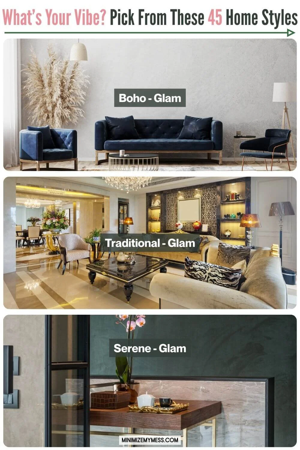
How it changes a space: Glam turns up the volume on any core style, adding sheen, sophistication, and drama. Even the simplest furniture becomes a showpiece when paired with metallics, bold shapes, or luxe textures. Perfect for those who love sparkle, glamour and dazzle.
Key colors: Jewel tones like emerald, sapphire, and amethyst; black and white with gold or silver; blush pink, deep plum, or rich navy paired with metallics.
Examples of how to bring it to life:
Velvet or tufted furniture: Chesterfield-style sofas, tufted headboards, or tufted ottomans scream glam
Furniture with scalloped edges, barrel chairs, and rounded sofas that feel luxurious and inviting
Mirrored or lacquered side tables and desks
Ornate vanities
Coffee tables or side tables with dramatic, art-like bases (e.g., criss-cross metal, geometric forms, or marble pedestals)
Gold/brass/silver frames on chairs, tables, or shelving units for an instant glam upgrade
Gold or brass accents on lighting and decor
Crystal or statement chandeliers
Framed art or fashion photography in bold black and white
Glossy surfaces, high-shine finishes
Faux fur throws or metallic-threaded cushions
A styled bar cart
High-end perfume tray
Similar to: Art Deco, Romantic, Monochrome, Contemporary, Preppy, Regency
global collection
Mood: Well-traveled, layered, and soulful. The Global Collection style looks like it was curated over a lifetime of adventures. Think Pier One meets a vibrant market in Marrakesh.

How it changes a space: Global Collection adds depth, texture, and cultural richness. It pulls in patterns, textiles, and materials from around the world - combining them in a way that feels intentional and collected, not chaotic. This style tells stories through your decor and celebrates craftsmanship and heritage.
Key colors: Terracotta, ochre, indigo, clay, jewel tones, warm wood, and pops of saffron, teal, or magenta.
Examples of how to bring it to life:
Kilim rugs or patterned textiles from various regions
Carved wood furniture with intricate details (e.g., Indian sideboards, Moroccan tables)
Woven baskets, rattan chairs, cane cabinets
Brass or copper accents - bowls, vases, trays
Tribal patterns on pillows or throws
Handcrafted pottery or ceramic pieces
Beaded or woven light fixtures
Global artwork, maps, or travel photography
Layered textiles with embroidery, tassels, or fringe
Mismatched furniture that still feels cohesive through texture or color
Similar to: Eclectic, Boho (Classic), Earthy, Rustic, Artsy
A quick note on appreciation vs. appropriation:
Global-inspired decor should celebrate and respect the cultures it draws from.
Seek to appreciate, not appropriate. That means learning about the origins of the pieces you love, supporting artisans and ethical businesses, and avoiding mass-produced items that exploit sacred or cultural symbols.
When possible, buy directly from makers or fair-trade shops - it adds meaning to your space and supports those behind the craft.
grandma chic
Mood: Sentimental, layered, and charmingly nostalgic. Grandma Chic feels like raiding your nan’s house - in the best way. It’s cozy, quirky, and full of personality, with an old-soul vibe that mixes heirloom treasures with bold modern touches. Think tea cozies, needlepoint, and a well-loved armchair …but with sass! Imagine walking into a cozy local antique store or a home goods aisle curated by Iris Apfel.
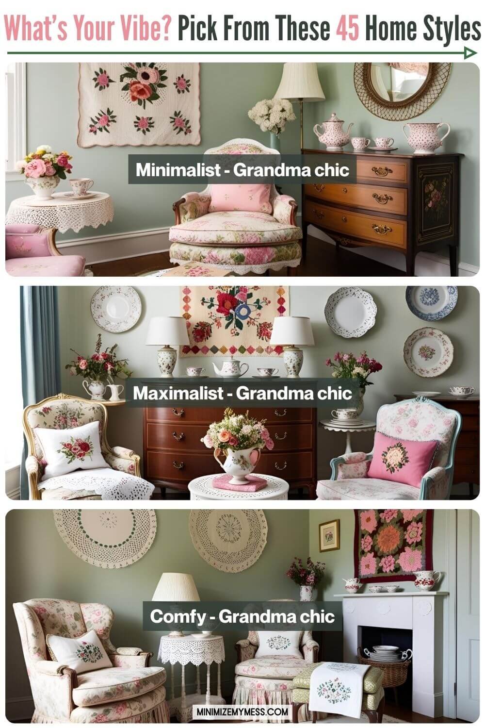
How it changes a space: Grandma Chic turns any home into a storybook of collected memories. It’s not about sleekness or minimalism - it’s about soul. This style celebrates the sentimental: family photos, embroidered linens, and knick-knacks with stories. It brings comfort and character while giving permission to mix clashing patterns, thrifted finds, and beloved clutter with total pride. Picture: the Golden Girls living room.
Key colors: Rose, dusty blue, mustard, sage, faded burgundy, ecru, mixed with unexpected pops like teal or fuchsia.
Examples of how to bring it to life:
Doilies layered over vintage side tables
Floral upholstered armchairs
Needlepoint wall hangings or handmade quilts
A mix of patterned teacups or mismatched china
Antique dressers used as sideboards
Knitted or crocheted throws
Artfully displayed clutter: figurines, framed cross-stitch, stacked books
Wallpaper in floral or damask prints
Similar to: Shabby Chic, Cottagecore, Vintage, Traditional, Eclectic
How Grandma Chic differs from Cottagecore: Cottagecore is more romantic and nature-driven, think picnics, wildflowers, and countryside fairytales. Grandma Chic leans more into quirky nostalgia, family heirlooms, and layered clutter, often with bolder colors and more kitsch.
How Grandma Chic differs from Shabby Chic: Shabby Chic is more polished and feminine - all whitewashed furniture, pastel florals, and curated softness. Grandma Chic is less staged and more storied. It embraces visual chaos, vibrant color combos, and the “lived-in museum” feel.
Industrial
Mood: Raw, utilitarian, and urban-cool. Industrial interiors feel like a converted loft or factory - all exposed brick, weathered wood, and metal pipes. It’s gritty but intentional, and feels like stepping into a space that’s both tough and stylish. Think Restoration Hardware meets an East London warehouse.

How it changes a space: Industrial adds edge, structure, and a masculine energy to any home. It’s especially great at grounding more playful or colorful styles, or adding character to minimalist spaces. It emphasizes function, structure, and authenticity - no frills, just bold, raw materials.
Key colors: Charcoal, black, steel gray, rust, warm wood tones, tan leather, brick red, and concrete-inspired neutrals.
Examples of how to bring it to life:
Exposed brick walls or faux brick wallpaper
Black metal shelving or pipe-style open storage
Repurposed items, reclaimed wood & visible joinery
Edison bulb light fixtures with visible cords
Concrete or butcher block countertops
Oversized leather sofas or distressed armchairs
Factory-style pendant lights over dining tables
Metal-framed beds & stools
Vintage lockers, drafting tables, or repurposed workbenches
Large-scale black and white photography, framed blueprints or maps, vintage signs, graffiti art, or metal wall sculptures
Steel-framed coffee tables with wood tops
Similar to: Urban, Rustic, Masculine, Modern, Minimalist, Eclectic
How Industrial differs from Urban: While both styles draw inspiration from city living and exposed architecture, Industrial is more raw and rugged. It draws inspiration from the warehouse shell itself - think brick walls, metal pipes, concrete floors, and factory vibes. On the other hand, Urban blends a touch of those elements with contemporary furniture, bold art, and more trend-forward touches.
Japandi
Mood: Calm, intentional, and quietly luxurious. Japandi blends the minimal elegance of Japanese design with the cozy simplicity of Scandinavian style. It’s all about balance, restraint, and warmth - imagine a Muji meets IKEA moment, with a sprinkle of spa energy. Think: A peaceful retreat filled with soft neutrals, tactile textures, and beautifully crafted basics. Stores like Muji, Ferm Living, or Zara Home (for budget-friendly finds) nail this mood.
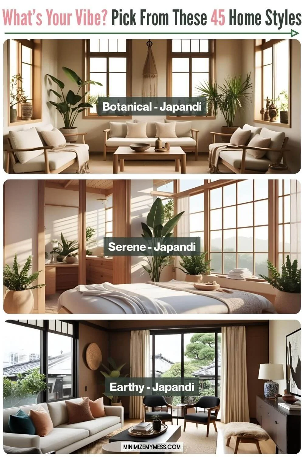
How it changes a space: Japandi creates a sense of calm and order while still feeling welcoming. It invites you to slow down and savor your surroundings. This style reduces visual noise through clean lines and open layouts, while still incorporating warm, earthy textures to keep things from feeling cold or clinical.
Key colors: Warm neutrals like taupe, sand, and oatmeal, paired with soft black, natural wood, off-white, stone grey, and muted sage or blush.
Examples of how to bring it to life:
Low-profile furniture with rounded corners, exposed wood grain, and zero fuss
Tatami-style floor cushions, low wooden tables
Linen curtains or light cotton textiles
Slatted wood accents or room dividers
Wabi-sabi-inspired ceramics and handmade pottery
Open shelving with breathing space between items
Indoor plants in neutral-toned pots
Floor lamps with soft, diffused light & paper lantern lighting
Neutral-toned bedding with layered natural textures
Minimalist storage that tucks everything away
Similar to: Minimalist, Scandinavian, Wabi-sabi, Serene, Contemporary, Botanical
🔝 Back to Top 🔝
Lived-In
Mood: Relaxed, familiar, and authentic. A space that tells the story of the people who live there - comfortable, a little imperfect, and full of life. This tone is your permission slip to stop chasing the impossible ideal of a showhome and start embracing a home that actually works for real life. A home that looks loved, not staged.

How it changes a space: A lived-in tone strips away the pressure to have a perfect, Instagram-ready home. It celebrates real life, memories, and functionality. It can soften minimalism or add grounding warmth to a bolder core style.
Examples of how to bring it to life:
Books stacked in corners, not just styled on shelves
Kids’ artwork proudly taped to the wall or fridge
Worn leather or vintage furniture with character
Everyday items in view - a mug tree, a coat rack, a dog bed
Personal mementos and travel souvenirs
Signs of life like a half-finished puzzle or Lego set in progress
Similar to: Cozy, Comfy
The lived-in look is perfect for parents - here’s my favourite trick for toy mess
Masculine (formal)
Mood: Sleek, confident, and understated. This style leans into rich textures, sharp lines, and a “grown-up cool” aesthetic. It’s modern without being cold - think stylish bachelor pad. Stores like West Elm or Article are good examples.

How it changes a space: Refined Masculine brings structure and sophistication. It balances strength with restraint - fewer pieces, each chosen with care. It’s ideal for those who want their home to feel polished, grounded, and effortlessly stylish.
Key colors: Charcoal, black, walnut, navy, espresso brown, slate, olive, leather tan. Accents in metal (like brushed brass or matte black) add an elevated edge.
Examples of how to bring it to life:
Low leather or tweed sofas with crisp silhouettes
Dark wood and metal furniture with clean, angular lines
Dark, moody walls or accent walls
Vintage bar carts, decanters, or cigar trays
Sculptural lighting (like arc floor lamps or minimalist pendants)
Framed black-and-white photography or abstract art
Rugs in herringbone, plaid, or geometric patterns
Layered textiles in wool, suede, or structured linen
Similar to: Contemporary, Mid-century Modern, Industrial, Urban, Moody, Minimalist, Traditional, Preppy
Masculine (casual)
Mood: Energetic, casual, and functional. This style blends utility with personality, creating a relaxed space that reflects active hobbies, team pride, and comfort-first living. Think man cave, game day central, or a garage-turned-hangout spot.
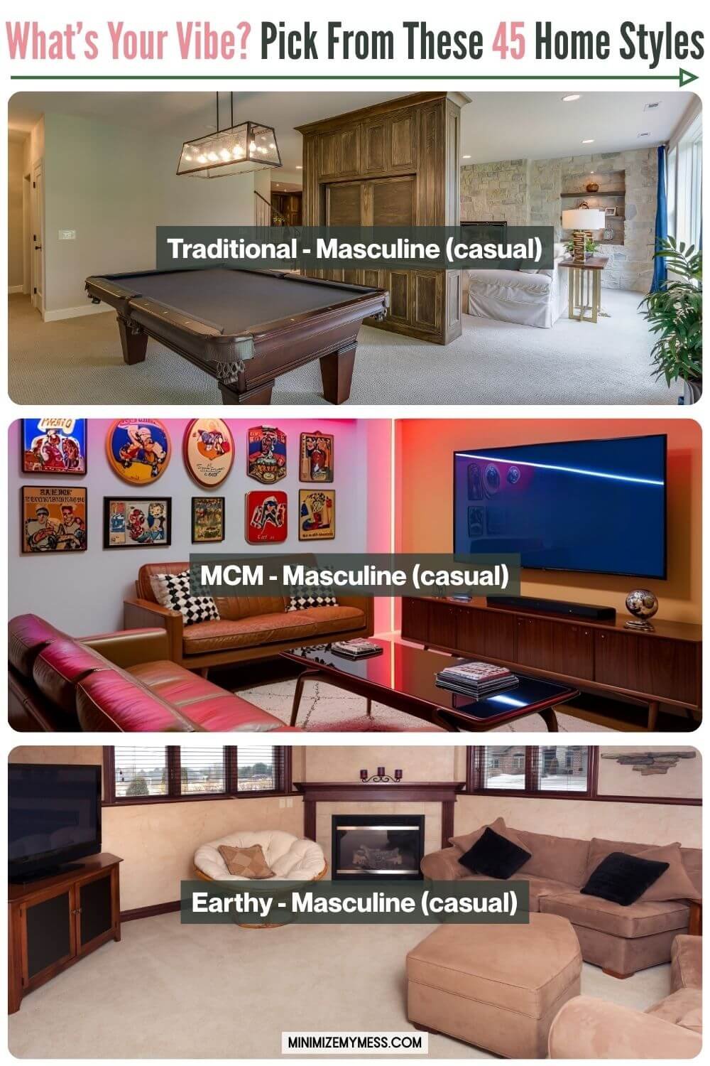
How it changes a space: Sporty Masculine brings a lived-in, laid-back energy. It’s about showcasing interests - whether that’s sports, fitness, tech, or gaming - and designing a space that’s low-maintenance and built for downtime. It often leans heavier on function than aesthetics, but still creates a cohesive, personal environment.
Key colors: Team colors, dark neutrals like black, gray, navy, and denim blue. Pops of red, green, or yellow from memorabilia or gear.
Examples of how to bring it to life:
Framed jerseys or sports memorabilia on display
A big, comfy sectional or recliners for lounging
Games tables, consoles, sound systems, or projector setups
Gym equipment, gear storage, or multi-purpose zones
Mini fridge or snack zone
Display shelves for trophies, memorabilia, records, or collectibles
Bold wall art (like neon signs, skateboards, or posters)
Similar to: Lived-In, Comfy, Industrial, Maximalist, Retro
Maximalist
Mood: Bold, expressive, collected. A curated treasure trove. More is more. Picture: intense designs by House of Hackney.

How it changes a space: A maximalist tone invites richness, color, and personality. Instead of stripping back, it layers. Think of a room where every corner has something interesting to look at - whether it’s books, art, plants, or textiles. It's about abundance without chaos - everything tells a story.
Key colors: Rich jewel tones, bold contrasts, full rainbows, or even intentional clashes. Emerald green, mustard yellow, hot pink, navy, and burnt orange would be great splashes of color in a maximalist-toned home.
Examples of how to bring it to life:
Gallery walls packed with art and oddities
Bold patterned wallpaper or rugs
Open shelves filled with books, trinkets, and treasures
Layered textiles: pillows, throws, patterned curtains
Statement lighting (think sculptural or vintage chandeliers)
Lots of plants, collected decor, or thrifted finds
Similar to: Eclectic, Artsy, Boho (Classic), Memphis, Playful, Grandma Chic, Global Collection, Retro
Mediterannean
Mood: Sun-soaked, earthy, and breezy. Mediterranean style draws inspiration from coastal regions like Spain, Greece, and Italy, creating a warm, timeless, and inviting atmosphere. Imagine terracotta tiles, whitewashed walls, and olive trees swaying outside. Picture: the house from Mama Mia

How it changes a space: Mediterranean style brings warmth, texture, and an indoor-outdoor feel. It adds a rustic yet refined charm and feels incredibly timeless. It’s perfect for those who love organic textures, natural materials, and sun-drenched spaces.
Key colors: Warm neutrals, sandy beige, sun-baked terracotta, olive green, sea blue, white, and deep mustard.
Examples of how to bring it to life:
Arched doorways or curved furniture edges
Terracotta pots and earthenware
Wrought iron light fixtures & furniture accents
White or stucco-textured walls
Layered linens and gauzy curtains
Rustic wood furniture with ornate or aged details
Mosaic tiles or patterned ceramics
Olive branches, citrus, or lavender as decor or scent
Similar to: Earthy, Rustic, French Country, Botanical, Coastal, Global Collection
🔝 Back to Top 🔝
Memphis
Mood: Bold, quirky, and unapologetically fun. Memphis style is a throwback to the 1980s Italian design movement - full of wild colors, geometric shapes, and playful patterns. It’s loud, rebellious, and makes no attempt to blend in. Think of it as a combo of Pee-wee’s Playhouse, the opening credits of Saved By The Bell, and a postmodern art gallery.

How it changes a space: Memphis instantly injects a sense of boldness and creative chaos. It challenges minimalism with maximal pattern, contrast, and color blocking. A little goes a long way - even one Memphis-inspired piece can make a space feel more energized and daring.
Key colors: Hot pink, teal, mustard yellow, cobalt blue, black & white, often used in high contrast and unexpected combinations.
Examples of how to bring it to life:
Geometric shelving or decor
Abstract squiggle patterns or checkerboards
Bold, colorful laminate furniture
Sculptural chairs or postmodern sofas
Graphic rugs in clashing patterns
Neon or fluorescent lighting
Pop art or cartoonish wall art
Glossy surfaces and lacquer finishes
Color blocking and scalloped or wavy painted accents around doorways
Similar to: Playful, Retro, Bright, Eclectic, Maximalist, Artsy
Mid-Century Modern
Mood: Timeless, functional, and effortlessly cool. Mid-Century Modern (MCM) blends clean lines with organic shapes, natural materials, and a “less is more” philosophy. It’s sleek, smart, and unfussy - like stepping into a well-designed 1950s home that still feels relevant today. Picture: Mad Men or a Herman Miller showroom

How it changes a space: MCM brings warmth and structure. It’s ideal for creating a space that feels ordered but not cold, retro but not dated. The simple silhouettes and open layouts make rooms feel calm and livable, while vintage touches add charm.
Key colors: Earth tones like olive, mustard, rust, and walnut brown, mixed with pops of teal, orange, avocado green, or muted pastels.
Examples of how to bring it to life:
Low-profile, tapered-leg furniture
Wood credenzas and sideboards
Splayed coffee tables
Vintage-inspired sofas in textured fabrics
Minimalist wall systems: Sleek, modular shelving systems made from warm woods like teak or walnut, often paired with slim black or brass hardware. They typically feature a mix of open shelves, sliding-door cabinets, and drawers - all elevated off the ground to keep the space feeling light and airy. Some versions are freestanding, while others are mounted directly to the wall or supported with vertical poles.
Sputnik chandeliers or globe pendant lights
Starburst mirrors and atomic motifs
Eames-style chairs or molded plastic seating
Graphic art prints or color-blocked wall art
Similar to: Scandinavian, Minimalist, Modern, Retro, Earthy, Contemporary
Minimalist
Mood: Calm, clean, and focused. A space that breathes. Less is more.

How it changes a space: A minimalist tone strips things back to the essentials, creating a peaceful, clutter-free environment. It emphasizes space, light, and purpose. Every item has a function or a clear reason for being there. It creates a grounding energy, ideal for those who feel overstimulated by visual noise.
Key colors: White, beige, soft gray, and black accents, with occasional muted tones like sage, dusty rose, or oatmeal.
Examples of how to bring it to life:
Bare walls or very intentional artwork (e.g., one large-scale piece)
Neutral-toned furniture with clean lines
Hidden storage to reduce visual clutter
Natural light maximized with sheer curtains or no curtains at all
1-3 items on a shelf instead of a cluster
Thoughtful empty space - let things breathe
Similar to: Japandi, Scandinavian, Contemporary, Monochrome, Serene, Wabi-Sabi
Monochrome
Mood: Sleek, focused, and visually striking. Monochrome interiors use a single dominant color (or variations of one hue) to create a cohesive, high-impact space. Whether it’s classic black and white or all shades of sage, monochrome feels bold, intentional, and effortlessly stylish.

How it changes a space: Monochrome simplifies while elevating. It creates a strong sense of harmony and visual clarity, and makes even eclectic objects feel curated. It’s perfect for anyone who wants their home to feel modern, editorial, and pulled-together without a lot of fuss. Bonus: it plays beautifully with contrast and texture.
Key colors: Any single-color palette. Black and white is the classic, but you could do all blues, all greys, all sage greens, all pinks, etc. Focus is on tone-on-tone variation, not multicolor contrast.
Examples of how to bring it to life:
Use one color in varying tones, from light to dark (e.g., dusty rose to deep plum)
Stick to black and white with strong graphic lines
Layer the same color in different materials: matte, glossy, velvet, wood, marble, ceramic, etc.
Create depth with texture, not color: think boucle chairs, linen curtains, wool rugs, glass vases
Use a single statement color across walls, upholstery, and decor for a dramatic effect
Keep accessories tonal: e.g., swap colorful book covers for neutral dust jackets, or display white ceramics on white shelves
Similar to: Minimalist, Contemporary, Art Deco, Glam, Moody
Moody
Mood: Bold, dramatic, and atmospheric. A space that feels a little mysterious, a little emo-luxe - like a quiet, candlelit bar or a cozy reading nook on a rainy day. Moody interiors often feel cocooning and rich. Works beautifully with both modern and vintage pieces. Picture: Abigail Ahern interiors.

How it changes a space: A moody tone adds intensity and emotion. It can turn any core style into something more grounded, intimate, or dramatic. Even minimalist spaces can feel richer and more layered when made moody. It’s ideal for those who want their home to feel soulful, cinematic, or slightly edgy.
Key colors: Charcoal, navy, forest green, aubergine, rust, black, and other deep tones - often paired with neutrals like cream, camel, or gray to keep things balanced. Metallics can elevate the drama.
Examples of how to bring it to life:
Painted walls or ceilings in rich, saturated colors
Velvet or leather upholstery in deep hues
Bold touches like mirrors, animal skulls, and floor-to-ceiling curtains can add to the drama
Dimmable lighting or layered light sources (table lamps, sconces, candles)
Large vintage rugs & dark-stained wood furniture
Moody art or photography (landscapes, portraits, abstract)
Layered textures: knits, sheepskin, suede, silk
Similar to: Industrial, Masculine (Formal), Regency, Urban
🔝 Back to Top 🔝

palm beach
Mood: Bold, breezy, and unapologetically glamorous. Palm Beach style blends coastal ease with high-end flair - like sipping cocktails by the pool in a kaftan and oversized sunglasses. Think of it as Old Hollywood meets tropical vacation, often with a wink of playful kitsch. Picture the vibe of a Lilly Pulitzer store, or a boutique hotel lobby in Palm Springs. It’s playful but polished.

How it changes a space: Palm Beach adds a punch of personality and polish to otherwise laid-back spaces. It brings in bright colors, bold prints, and a healthy dose of glamour with a retro nod. This style doesn’t take itself too seriously, but always looks chic and pulled together.
Key colors: White, coral, aqua, grassy green, banana yellow, navy, and hot pink - often set against crisp neutrals. Gold and lacquered accents are key.
Examples of how to bring it to life:
Palm leaf or banana leaf wallpaper
Faux bamboo furniture or glossy lacquered pieces
Chinoiserie prints and ginger jars
Cane or rattan chairs with bright cushions
Greek key or lattice patterns in textiles
Sculptural ceramic lamps or seashell mirrors
Tropical motifs - botanical, flamingos, pineapples, monkeys, etc.
Similar to: Glam, Coastal, Vintage, Mid-Century Modern, Eclectic, Botanical, Playful
Playful
Mood: Fun, energetic, and full of joy. A space that doesn’t take itself too seriously and is full of personality. Think pops of color, unexpected details, or cheeky decor.

How it changes a space: A playful tone brings energy, unexpectedness, and delight. Great for sparking curiosity and conversation - ideal for kids-at-heart, creative types, or anyone who wants their space to feel upbeat and welcoming. You could really lean into whimsy of it all with quirky and delightful surprises that could be right out of a storybook.
Key colors: Brights or pastels are great for a playful tone - think coral, mustard, mint, sky blue, bubblegum pink, and citrusy yellows. Black or white accents can help balance out the fun, or unexpected color combos like lavender and mustard or pink and green can dial it up a notch.
Examples of how to bring it to life:
Bold or quirky artwork (like line drawings, animal figurines, pop art, or retro storybook illustrations)
Fun patterns - polka dots, stripes, playful florals
Sculptural or novelty furniture and decor (like a wavy mirror or a smiley face rug)
A gallery wall with unconventional items, postcards, or framed jokes
Color-dipped furniture legs or painted ceilings
Themed decor in one room or throughout the home (for example, showcasing a collection of frog figurines, or items inspired by Alice in Wonderland)
Playful lighting, like globe pendants or colorful lamps
Whimsical details like scalloped edges, ruffles, or confetti-style colors
Accessories that make you smile (like fruit-shaped cushions, rainbow mugs, or a funky doormat)
Similar to: Memphis, Retro, Eclectic, Artsy, Palm Beach, Maximalist
preppy
Mood: Classic, cheerful, and tailored with a twist. Preppy interiors feel polished and upbeat - a blend of tradition and youthful personality. It’s the home version of a popped collar and a monogrammed tote: crisp, colorful, and subtly posh. Imagine: walking into a Serena & Lily store or a Ralph Lauren Home showroom. You’ll find symmetry, stripes, and upscale beach house energy.

How it changes a space: Preppy style adds structure and brightness. It pulls in classic design elements (like symmetry and timeless furniture shapes) but mixes in bold colors, patterns, and playful details. It brings order with a smile - great for those who want a space that feels both elegant and fresh.
Key colors: Navy, bright green, white, red, coral, blush, butter yellow, and sky blue. Lots of white as a base with bold, clean pops of color. Monograms and stripes are a prominent feature.
Examples of how to bring it to life:
Nautical or collegiate-inspired artwork (e.g. oars, crests, horse prints)
Patterned wallpaper with stripes, gingham, or plaid
Upholstered furniture with piping, rolled arms, and tailored skirts
Wingback chairs and tufted ottomans for a polished but cozy vibe
Lacquered furniture – especially in navy, white, or bold preppy hues (great for a pop of color)
Campaign-style furniture – especially desks and dressers with brass hardware
Canopy or spindle beds – elegant and tailored without being overly ornate
Bookshelves styled like a prep school library – think symmetrical, polished, and filled with classic hardcovers, trophies, and framed photos
Brass or gold accents, especially in lighting and hardware
Throw pillows with monograms or preppy prints (like anchors or tennis rackets)
Similar to: Traditional, Coastal, Vintage, Masculine
regency
Mood: Elegant, opulent, and theatrical. Regency style is all about drama, symmetry, and refined excess - think Bridgerton ballrooms, Jane Austen drawing rooms, and a sprinkle of royal flair. Imagine walking into a set from a period drama or a modern-day palace.

How it changes a space: Regency tones instantly elevate a room with structure and elegance. It adds a sense of grandeur and occasion, even in the smallest of spaces. While it can lean traditional, it pairs beautifully with both bold color and contemporary twists for a fresh take on historic glam. This style is perfect for those who want their home to feel intentional, cultured, and a little bit fabulous.
Key colors: Deep navy, emerald, burgundy, blush, gold, ivory, charcoal, and rich jewel tones. Black and white contrasts also feature prominently, as do metallics like brass and antique gold.
Examples of how to bring it to life:
Symmetrical room layouts with matching chairs or side tables
Ornate wall mouldings and paneling
Marble or faux-marble accents
Velvet or silk drapes with tassels or tiebacks
Gilded mirrors, chandeliers, and candle sconces
Greek key or laurel motifs in decor and textiles
Curved or fluted furniture legs and rolled arms
Upholstery in luxe fabrics like velvet or damask
Statement wallpaper (toile, stripes, damask)
Decorative busts, classical statues, or painted portraits
Similar to: Glam, Art Deco, Traditional, French Country, Romantic, Vintage
retro
Mood: Fun, bold, and full of nostalgia. Retro style celebrates the groovy energy of the mid-20th century - from 60s mod to 70s disco and 80s pop. Think funky patterns, rounded furniture, and a splash of cheeky attitude. Picture a blend of The Jetsons, groovy diners, and neon roller rinks.

How it changes a space: Retro brings personality in spades. It’s playful, high-energy, and unapologetically stylized. This style turns your home into a time capsule - but with a curated, intentional feel. It’s great for those who love bold choices, cheerful palettes, and mid-century throwbacks that don’t take themselves too seriously.
Key colors: Mustard yellow, burnt orange, avocado green, cherry red, turquoise, baby blue, hot pink, and black-and-white checkers.
Examples of how to bring it to life:
Bold geometric or groovy psychedelic wallpaper
Kidney-shaped coffee tables and tulip chairs
Wood paneling (especially medium-to-dark tones like walnut or teak)
Lacquered wood furniture and built-in cabinetry
Wall-to-wall carpet in mustard, rust, or olive
Rattan and cane details emerged more in the late 70s into the 80s
Bubble or sputnik light fixtures
Vinyl records and vintage radios on display
Lava lamps, rotary phones, and retro clocks
Patterned linoleum floors or checkerboard tiles
Chrome + plastic combinations on furniture
Curved, low-profile modular sofas
Similar to: Mid-Century Modern, Playful, Eclectic, Memphis
🔝 Back to Top 🔝
Romantic
Mood: Soft, floaty, and dreamy. Romantic tones add feminine energy, elegance, and a sense of intimacy to a space. A romantic home feels like stepping into a story - part Bridgerton garden party, part pink velour boudoir, and everything in between. It leans into beauty for beauty’s sake, with an atmosphere that invites you to slow down and savor the moment.

How it changes a space: A romantic tone softens the edges of any core style. They bring an air of grace and timelessness, whether through vintage touches or a dreamy mood. This tone is ideal for people who love period dramas, handwritten notes, and soft textures that feel like a hug.
Key colors: Blush, mauve, dusty rose, cream, lavender, soft peach, gold accents.
Examples of how to bring it to life:
Candlelight or twinkle lights for soft illumination
Iridescent or opalescent decor
Pastel palettes with shimmer or light bounce
Flowing curtains or sheer drapes
Soft, ambient lighting like lamps or candlelight
Antique or vintage-inspired decor
Floral wallpaper or vintage-inspired prints
Velvet cushions, floral and toile patterns & tufted details
Antique mirrors and ornate frames
Fresh flowers in vases
Sentimental objects or handwritten notes on display
Suncatchers to spread sparkles around the room
Ornate crystalware used throughout the home, including a perfume bottle with one of those puffy squeezers (I do believe that’s the technical term 🤣)
Boudoir touches like ruffles, lace, or mirrored trays
Similar to: Shabby Chic, Cottagecore, French Country, Vintage, Glam, Regency, Grandma Chic
rustic
Mood: Warm, rugged, and natural. Rustic style brings the charm of the countryside or mountains indoors, with a weathered, unpolished, and earthy feel. It’s about embracing imperfections, aged textures, and nature-made materials. Think: a cozy cabin, lodge, or mountain retreat with a crackling fire and a mug of hot cocoa. Imagine cabin-themed pieces from Pottery Barn or Magnolia Market.
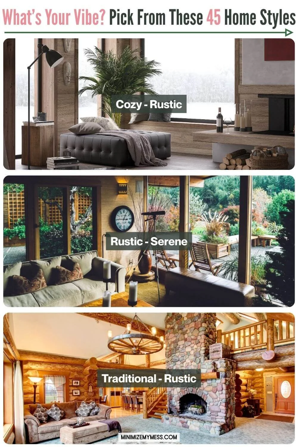
How it changes a space: Rustic design adds warmth, authenticity, and texture to any home. It grounds more modern styles and adds character and coziness. Perfect for those who crave connection to nature, comfort, and a touch of heritage.
Key colors: Warm woods, earthy neutrals, clay, forest green, charcoal, deep rust, and creamy whites.
Examples of how to bring it to life:
Exposed wood beams or reclaimed wood walls
Raw, unfinished wood furniture with chunky silhouettes
Natural stone or brick elements
Wrought iron light fixtures or lanterns
Cowhide rugs or cozy wool throws
Oversized farmhouse tables
Deep, cushy sofas
Handmade pottery and woven baskets
Textured linens and wool fabrics
Antler decor or vintage outdoor gear (e.g., snowshoes, lanterns, skis)
Similar to: Farmhouse, Cottagecore, Earthy, Masculine, Cozy
Scandinavian
Mood: Clean, cozy, and effortlessly stylish. Scandinavian design (aka “Scandi”) blends functionality with warmth, offering a sense of calm and simplicity without feeling stark. It’s where minimalism meets comfort, think: candles glowing on a tidy shelf, soft wool blankets, and lots of light. Picture walking into IKEA’s more neutral sections or Muuto’s soft, clean aesthetic - calm, practical, and welcoming.

How it changes a space: Scandinavian style creates balance: it's airy without being cold, minimal without being sterile. It adds a thoughtful, lived-in feeling to modern design and makes small or dark rooms feel more spacious. Ideal for those who love order, calm, and practical beauty.
Key colors: White, soft gray, warm wood tones, black accents, muted pastels (like blush, sage, or dusty blue).
Examples of how to bring it to life:
Light wooden floors and pale walls
Simple, functional furniture with tapered legs
Sofas: Clean-lined, low-profile, often in soft neutrals with cozy linen or cotton upholstery and light wood or slim metal legs.
Kitchens: Minimalist with flat-front cabinets, pale wood or matte finishes, open shelving, and simple stone or tile surfaces.
Sheepskin throws or chunky knit blankets
Lots of candles or warm, ambient lighting
Wall-mounted storage to keep clutter at bay
Minimal, nature-inspired decor (e.g., a sprig in a vase)
Open, airy layouts with purposeful negative space
Textured textiles like wool, linen, or felt
Muted patterned rugs or soft color-blocked art
Similar to: Japandi, Minimalist, Cozy, Serene, Contemporary, Bright, Mid-century Modern
Scandinavian vs Japandi: Japandi blends Scandinavian simplicity with Japanese minimalism. Scandi feels lighter and cozier; Japandi leans calmer and more grounded.
Scandinavian vs Minimalist: Scandinavian style is minimalist, but softer and more human. Where minimalism can feel stark or austere, Scandi adds warmth through textures, wood, and hygge-inspired touches. It’s minimalism with soul.
Serene
Mood: Calm, quiet, and soothing. A space that feels like a long exhale - uncluttered, balanced, and effortlessly peaceful. It’s about creating a gentle flow and a sense of stillness in your environment. A serene tone reflects today’s wellness design trends, where your home becomes a spa-inspired sanctuary for the senses.

How it changes a space: A serene tone brings softness and spaciousness. It helps any core style feel more calming and meditative. Perfect if you want your home to feel like a retreat - or even a spa - from the noise of everyday life. You might even bring in simple feng shui principles, like balanced furniture placement or the mindful use of elements, to create a more harmonious flow of energy.
Key colors: Soft neutrals, airy whites, sandy beiges, sage green, misty blue, warm greys, and gentle taupes. The focus is on low-contrast, harmonious palettes that don’t shout for attention.
Examples of how to bring it to life:
Sheer curtains that let in diffused natural light
Low-profile furniture with clean, flowing lines
Soft, natural materials like linen, wool, rattan, or clay
A limited color palette throughout the space
Nature-inspired artwork or botanical prints
Spiritual statues
Quiet corners for reading, resting, or meditating
Small ritual nooks - like a tray with candles, crystals, and a journal
Spa-like touches: soft towels, eucalyptus in the shower
Calming sensory elements like water features, soft incense, or essential oils
Open space or negative space to let your eyes and mind rest
Similar to: Japandi, Scandinavian, Minimalist, Wabi-Sabi, Earthy, Bright
SHABBY CHIC
Mood: Soft, romantic, and slightly worn in. Shabby Chic feels like stepping into a faded fairytale or an antique-filled sunroom. It’s full of vintage charm, pastel tones, and whitewashed finishes. Think Rachel Ashwell interiors, floral cushions, and furniture with delicate distressing.

How it changes a space: Shabby Chic softens everything. It adds a gentle, feminine, and nostalgic vibe that’s both elegant and approachable. It’s great for bringing charm to plain spaces or warming up cooler tones. Perfect if you love romantic touches, vintage finds, and a lived-in-but-lovely aesthetic.
Key colors: White, cream, soft pastels (especially blush, mint, and duck egg blue), faded florals, warm neutrals, and touches of antique gold or crystal.
Examples of how to bring it to life:
Distressed white furniture (armoires, vanities, dressers)
Slipcovered sofas and armchairs in soft linen or cotton
Floral or toile cushions and upholstery
Ruffled or lace-trimmed curtains and bedding
Antique mirrors with patina or ornate frames
Crystal chandeliers or vintage-style sconces
Layered textiles: crocheted throws, embroidered linens, faded rugs
Soft-focus floral artwork or vintage botanical prints
Decorative trays with candles, pearls, or old perfume bottles
Repurposed vintage finds (e.g., teacups as planters, old ladders as shelves)
Similar to: Romantic, French Country, Grandma Chic, Vintage, Cottagecore, Traditional
Shabby Chic vs Grandma Chic: Shabby Chic is more curated and pastel-toned, often aiming for a coordinated, magazine-ready look. Grandma Chic is quirkier, more layered, and celebrates clutter and kitsch.
Shabby Chic vs Cottagecore: Cottagecore is more rustic and nature-inspired. Shabby Chic leans elegant and polished with a vintage femininity.
🔝 Back to Top 🔝
southwestern
Mood: Warm, grounded, and sun-drenched. Southwestern style evokes desert landscapes, adobe homes, and Native American influences. It’s earthy yet colorful, with rustic charm and bold patterns. Think: a Santa Fe adobe meets a sunset palette.

How it changes a space: Southwestern style brings in warmth, cultural richness, and texture. It makes a room feel cozy but vibrant, rooted in the land with a strong sense of place. Ideal for those who love natural materials, lived-in charm, and a connection to the outdoors.
Key colors: Terracotta, sand, clay, turquoise, rust, sage green, mustard, black, and creamy neutrals.
Examples of how to bring it to life:
Woven textiles like Navajo-inspired rugs and saddle blankets
Saltillo tile or terracotta floors
Adobe-style fireplaces or plastered walls
Low-slung leather sofas or distressed leather armchairs with visible stitching or nailhead trim
Rough-hewn wooden coffee tables or console tables with a natural or reclaimed finish
Carved wood pieces with rustic or Native-inspired motifs
Wrought iron bed frames & dining chairs with a vintage or handmade feel
Chunky wood benches with woven seat details or hide-covered cushions
Upholstered seating with woven kilim or tribal fabrics
Handcrafted side tables with raw edges or ceramic tile inlays
Cacti or desert plants in ceramic pots
Earth-toned pottery and handwoven baskets
Bold geometric or tribal patterns in soft furnishings
Wooden ceiling beams or carved wood accents
Iron lighting fixtures or aged brass hardware
Artwork featuring desert landscapes or traditional motifs
Similar to: Rustic, Earthy, Farmhouse, Eclectic, Mediterranean
Traditional
Mood: Classic, timeless, and comforting. Traditional interiors feel familiar and grounded - like a well-loved library, a stately family home, or a historic inn. Everything feels balanced, coordinated, and considered. Think Pottery Barn or Ethan Allen.

How it changes a space: A Traditional style brings a sense of order and refinement. It’s ideal for those who love symmetry, rich textures, and enduring design. Traditional rooms tend to feel layered but not chaotic, warm but not overly ornate.
Key colors: Deep jewel tones (emerald, navy, burgundy), rich neutrals (beige, taupe, cream), classic combos like navy & white, or burgundy & gold. Wood tones lean dark - mahogany, walnut, cherry.
Examples of how to bring it to life:
Matching furniture sets (e.g., coordinating end tables and coffee table)
Wingback chairs, rolled-arm sofas, and tufted ottomans
Heavy curtains with pleats or swags
Ornamental-style rugs
Crown molding, wainscoting, or paneling on walls
Classic artwork like still lifes, landscapes, or portraits in gilded or carved frames
Antiques or heirloom-style pieces
Brass or crystal chandeliers and lamps with pleated shades
Formal dining sets with matching chairs
Symmetrical layouts and balanced styling (e.g., identical lamps on both nightstands)
Similar to: Regency (Traditional is less ornate), French Country, Grandma Chic, Vintage
urban
Mood: Cool, polished, and expressive. Urban interiors draw inspiration from city life - a mix of industrial bones, modern design, and trend-forward decor. Imagine walking into a stylish downtown loft or a creative’s live/work space. Think: West Elm meets a converted warehouse gallery.

How it changes a space: Urban style blends raw architectural elements with refined, curated decor. It’s less gritty and more contemporary than Industrial. It creates a sleek, artsy atmosphere without feeling too formal, often grounded in neutrals and brought to life through bold art, cultural references, or sculptural pieces.
Key colors: Charcoal, black, white, tan, grey, brick red, pops of bold color (like mustard, teal, or rust), and metallic accents.
Examples of how to bring it to life:
Exposed brick or concrete walls (or wallpaper mimics)
Clean-lined modern furniture with metal accents
Modular sectionals
Platform beds
Leather or velvet chairs
Acrylic coffee tables
Industrial-inspired bar stools.
Bold artwork or murals that take center stage
Open metal shelving with styled books and art
Floor-to-ceiling windows & black grid-style frames
Statement lighting, like geometric pendants or matte black lamps
Area rugs with abstract or high-contrast patterns
Minimal clutter, but personality-packed styling
Similar to: Industrial, Contemporary, Minimalist, Eclectic
vintage
Mood: Nostalgic, soulful, and storied. A vintage-style home feels lovingly curated, like each piece has a past. It’s not about chasing trends - it’s about cherishing charm, character, and history. You don’t need to stick to one decade - vintage can be a curated mix of beautiful old things from any era.

How it changes a space: Vintage style brings in history, character, and soul. It’s about choosing pieces with a past, whether they’re true antiques or vintage-inspired. This style creates a sense of depth and authenticity, and is perfect for those who love sustainability and one-of-a-kind finds. It can anchor modern spaces with timeless touches or create an entirely throwback feel. Whether you're showcasing a 1950s sideboard or a stack of weathered books from your grandparents' attic, vintage adds depth and storytelling to a room.
Key colors: It depends on the eras being drawn from, but it generally includes soft neutrals, faded pastels, olive greens, mustard, dusty rose, avocado, rust, navy, and aged wood tones.
Examples of how to bring it to life:
Antique or secondhand furniture (think dressers, vanities, or dining sets with patina)
Ornate picture frames, gilded mirrors, and vintage wall art
Rotary phones, radios, or typewriters as decor
Vintage textiles like embroidered linens, crocheted doilies, or chenille bedspreads
Patterned wallpapers or floral upholstery
Milk glass, jadeite, or other retro kitchenware
A display case of heirloom china or glassware
Mix-and-match dining chairs
Old trunks, suitcases, or repurposed pieces used as coffee tables or storage
Layered rugs, including Persian or kilim-style
Clawfoot tubs or pedestal sinks in bathrooms
Glass cabinet displays with vintage trinkets or collections
Similar to: Traditional, Romantic, Grandma Chic, Shabby Chic, French Country, Retro, Eclectic
Vintage Vs Retro: Retro is about boldness and fun. It pulls from the design trends of the 50s through the 80s, often with bright colors, funky patterns, and a playful, kitschy vibe. Think lava lamps, shag rugs, orange laminate, and chrome bar stools. It’s more pop culture-driven, punchy, and often a bit tongue-in-cheek.
Vintage Vs Shabby Chic & Grandma Chic: Shabby chic & Grandma Chic both have a more feminine energy, whereas vintage is more focused on authentically showcasing the past
wabi sabi
Mood: Peaceful, imperfect, and deeply grounded. Wabi-Sabi embraces the beauty of transience, imperfection, and authenticity. Inspired by Japanese philosophy, it values simplicity, natural aging, and lived-in charm. Picture: a space designed by Axel Vervoordt. Think: a more rustic version of Japandi.

How it changes a space: Wabi-Sabi tones down the pressure to be polished. Instead of pristine surfaces and symmetry, it leans into organic textures, patina, and space to breathe. It’s perfect for creating a mindful, calming environment that feels soulful and real - not staged.
Key colors: Muted, earthy tones - stone gray, clay, sand, moss, slate, and off-whites - alongside weathered wood and soft neutrals.
Examples of how to bring it to life:
Uneven, handmade ceramics or vessels
Cracked or worn wood furniture that shows its age
Low, sturdy silhouettes – grounded pieces like low wooden tables or platform beds that feel rooted to the earth
Irregular or imperfect edges – live-edge wood, hand-thrown ceramics, or uneven finishes are ideal
Soft curves over sharp lines – furniture may have rounded corners or softly worn shapes rather than rigid geometry
Weathered, patinaed surfaces – think worn wood, oxidized metal, or stone that tells a story
Exposed joinery – like visible dowels or wooden pegs, highlighting the craft of construction
Unlacquered or matte finishes – avoid glossy or polished looks in favor of raw textures
Linen or raw cotton fabrics with natural wrinkles
Asymmetry in design - imperfect pairings or mismatched objects
Negative space and thoughtful object placement
Stoneware, rattan, clay, and aged metals
Soft, ambient lighting and candles
Branches, dried flowers, or seasonal foraged items in vases
Similar to: Japandi, Earthy, Minimalist, Serene, Rustic, Monochrome
Wabi-sabi Vs Japandi: Wabi-sabi is a chunkier and more imperfect version of the clean lines and smooth textures of Japandi.
🔝 Back to Top 🔝
Benefits of creating a style blend
Creating a style blend for your home is great because:
It helps you simplify decisions when shopping or decorating - No more guessing what “goes together” or panic-buying pieces that don’t work long-term. You’ll know exactly what to look for (and what to walk away from).
It keeps your space cohesive, not chaotic - Your style blend acts as a filter, keeping everything feeling intentional and connected.
It helps you discover your home’s color palette - Your style blend often naturally reveals the colors that may work well for you, making it easier to build a palette that flows from room to room.
It helps your home reflect who you really are - your home should tell your story, not Pinterest’s.
It makes curating and decluttering easier. Once you’ve defined your home style blend, it becomes much easier to let go of items that no longer fit and gradually add ones that do.
It brings more joy to your everyday environment - When your space aligns with how you want to feel, everything from making your morning coffee to hosting friends feels more intentional and authentically you.
It works even if you’re not arty-farty - This isn’t about perfection, it’s about clarity. You don’t need to be an interior designer to create a space you love. You just need a formula that works for you.
Example home style blends
Not sure where to start?
Here are some real-world examples of home style blends that work beautifully together:
Comfy + Botanical + MCM = A relaxed, planty take on a timeless classic. This is the style blend we landed on for our own home. I love the airy warmth of walnut furniture with tapered legs, paired with the jungle-like feel of all our plants. But comfort matters just as much to us - our space wouldn’t be complete without our nap-approved recliners.
Cozy + Serene + Japandi = A calm, retreat-like space with spa vibes and soft textures. Think low-profile furniture, linen curtains, and a muted palette that makes you breathe deeper the second you walk in. We’re talking flickering candles, floor cushions, and a home that whispers, “Exhale.”
Romantic + Cozy + Coastal = Soft, breezy, and made for slow mornings. This style blend feels like reading love letters by the sea. Picture gauzy white curtains blowing in the breeze, a cozy slipcovered armchair with a blush throw, and fresh flowers next to a seashell-trimmed mirror. Pale pink meets sandy beige, layered with linen textures and gentle sparkle. It’s romantic, but relaxed.
Maximalist + Moody + MCM = Retro drama with bold personality. This is a curated explosion of velvet, walnut, and deep color. Think a navy-painted living room with a gallery wall that climbs to the ceiling, a starburst chandelier, and a mustard sofa from the 60s. Every corner has a story; every texture adds depth. It’s bold, layered, and totally unapologetic.
Minimalist + Bright + Farmhouse = Clean lines meet cozy charm. Simple, sun-filled, and practical without being plain. Imagine white shiplap walls, matte black fixtures, and a big farmhouse sink - but with no clutter and plenty of breathing room. Natural wood tones, creamy neutrals, and just a hint of softness through linen and light. It’s minimalism with a warm hug.
Next steps
Now you know your unique interior style blend …so now what?
Should you just toss everything and start fresh with pieces that match your style?
I’d recommend a more eco-friendly (and realistic!) approach for the things you already own:
Start by shopping your home – move things around, restyle shelves, or see if something works better in a different room. You might be surprised what feels fresh just by shifting the context.
Put items that suit your style blend front and centre so they have the most impact. These are the pieces that will start steering your space in the right direction.
If something doesn’t fit your style blend, you don’t need to chuck it out right away. Try storing it out of sight for a while. If you don’t miss it, it might be ready for a new home.
When you do let go of things, donate, sell, or repurpose what you can (that old side table might make a perfect plant stand with a little paint).
Here are some ways to be intentional when it’s time to replace things:
You can use your unique home style blend as a filter when considering new to you items: If it doesn’t match the vibe, it doesn’t belong.
Make notes of what you do and don’t like, or create a Pinterest board to solidify your style and make future decisions easier.
This isn’t about a complete makeover overnight - it’s about alignment.
Gradually, your space will shift to match your authentic interior style blend, and you’ll be so pleased you narrowed it down.
Conclusion
There you go my lovely - finding your unique home decor style doesn’t have to be overwhelming.
With a simple style blend formula, you can create a space that feels aligned, intentional, and deeply personal.
Whether you lean minimalist, cozy, vintage, or playful, your interior design should reflect who you are - not just what’s trending.
By blending 2–3 styles that speak to you, shopping intentionally, and making small, thoughtful updates over time, your home will start to feel more like you.
So go ahead - use your home style blend as your guide, and start turning your home into your favorite place to be.